


15 Interactive Map Templates to Create National, Regional & Global Maps

Written by:
Orana Velarde

When large amounts of data are presented as numbers on a spreadsheet, it’s not uncommon to hear groaning in the room. It’s worse if there are tons of variables and time frames.
Information visualization can make a huge difference.
Turning numbers, percentages, statistics, differences, ratios and other kind of boring, numerical data into a creative visualization can instantly make any information look more interesting.
In this article, you'll find a list of creative information visualizations, such as graphs, charts, diagrams, maps and other ideas to use for your next project.
You can also create some of them in Visme!
A stream graph is a variation of the stacked area graph.
But instead of a straight axis, the values are displaced along a central line which varies along with the shapes of the values. Its purpose is to visualize data over time for different categories.
The varying shapes and sizes of the values make the graph look like a flowing stream. Notice how each value or rivulet has a different color to make the graph easier to read.
The blue and turquoise stream graph above visualizes a weekend in tweets after an iPad launch. This visualization was published in the Harvard Business Review, and worked great to show the value of each word used in the tweets and give a better understanding of user reactions.
The second example of this type of information visualization is one of the largest stream graphs ever created. It’s an interactive visualization published in the New York Times.
The data in this stream graph is taken from box office receipts of movies according to their airing date. It's interactive so users can click on even the smallest rivulets to see what they represent.
Since stream graphs don’t have a fixed x-axis, too much data can complicate things. They work best with limited categories so that the overlapping doesn't compromise the readability of the data.
Use contrasting or complementary colors in a way that makes your chart nice to look at. If you can add interactivity, go for it! It will make your stream graph much more interesting and effective.
Remember that a stream graph is for visualizing data over time. If you run an e-commerce company, you can use a stream graph to show how well a style of clothing sells at specific times of the year.
You can use a tool like Displayr to create a stream graph or hire a data designer.
A Sankey diagram is used to visualize quantitative flows and their proportion to one another. The thickness of the lines depends on the amount or magnitude of the flow.
These can be visualized as arrows or lines that, as they travel across the diagram, can separate or come together according to the direction in which they are heading.
You might recognize this style of diagram because it’s used inside your Google Analytics. The Google Analytics Sankey diagram visualizes how visitors move around your site and what pages they land on.
Sankey diagrams work great for visualizing a path taken by users, by money or by energy. It can be created as a large diagram or a collection of small diagrams.
Below are some more examples of Sankey diagrams.
The first is a concept dashboard using a Sankey diagram to visualize email driven navigation. This Sankey concept has different sections specifying different email processes.
Click on this link to see how the designer explains the right way to read the diagram. If you have a Tableau account, you can use this workbook to create your own Sankey diagram.
Another example of an interactive Sankey diagram was created with data from the Forbes 2018 NFL Valuations. You can take a quick look at it below.
Click here to view the interactive version.
Sankey diagrams, just like other types of information visualization, can be very confusing if there is too much data that you need to show. The best way to know if you need a Sankey diagram is to analyze if your data is about a process or flow of values.
For example, it will work for visualizing a budget or how profits are reinvested. You can also choose to use a Sankey diagram to visualize data about passenger activity in an airport.
There are a few different tools for creating a Sankey diagram, and Tableau is one of them. But you can also try using the Sankey Diagram Generator to create one for yourself.
A chord diagram is used to visualize inter-relationships between different groups.
The values of the groups or entities are organized in a circle, and the relationships between them are created and shown with curves of different colors.
Chord diagrams are good for visualizing large amounts of data, but can get visually confusing if there are way too many variables. This can be minimized by using interactivity, which lets the viewer select variable or regions, making all others disappear or set behind an overlay.
The chord diagram above is an example by one of our favorite data viz artists, Nadieh Bremer. It visualizes a large group of Dutch Nationals and the data around their choice of smartphones.
The connecting curves show the change from one phone brand to another, while the hills represent no change at all. Click here to see how a chord diagram works and how she created this specific one.
A chord diagram is often pretty to look at, but can be confusing for people who don’t understand complex data visualizations. You should only choose this type of information visualization if you are able to explain how it works, and how your audience can read and make sense of it.
Using interactivity, as always, is a great way to do this. Nadieh, for the example above, created a story around the visualization so that viewers would better understand what was going on.
Use a chord diagram if you want your data to really look beautiful.
Remember that these diagrams are about inter-relations between groups or entities. A set of data about how something is used over time will not work with a chord diagram.
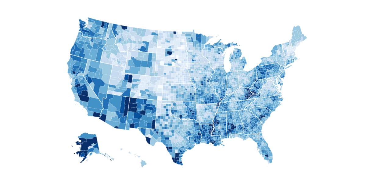
A choropleth is a geographic information visualization of data that pertains to regions in a map.
The regions shown on a choropleth map can represent anything you want, such as countries, counties, cities or neighborhoods. It all depends on what needs to be visualized.
The colors are set up as progressive color intensities in the same tonality or different colors that go well together. If the colors are too striking or off-putting, the data will be hard to understand.
The choropleth map above was created by Mike Bostock with data from unemployment rates in the US in 2016. The color sections are defined by counties inside each state. He only used white lines to separate the states so as to not make the visualization more crowded than it already is.
Use a choropleth map when you need to visualize geographic data. The most accurate type of data to use for this type of information visualization should be normalized instead of raw.
For example, instead of simply using the number of population per region, it's a better idea to use the density of population per square kilometer to represent each region.
Choropleth maps are also best used with one single kind of value that applies to all the regions. If you're working with different data values, a choropleth might not be the best visualization to use.
You can make a choropleth with Visme using the Map Engine.
In Visme, simply choose the regions you need to visualize, insert the data and customize the colors. You can also import data from an Excel or Google Sheet and then adjust the colors and labels.
Check out this video about making interactive maps in Visme.
Or use this guide to better understand how to create amazing choropleth maps.
A hex map is similar to a choropleth, but the regions are visually turned into hexagrams. The purpose is to equalize the size of the regions so no area looks more important than the others.
It’s important to maintain the original shape of the main region you are visualizing so that viewers know what they are looking at.
The same reasons to use a choropleth apply for using a hex map. The best data sets to use for this type of visualization should be simple and without variables.
Each region should only have one value to show and that is what will give it its specific color.
There are so many kinds of values you can apply to geographical regions, which means that a hex map can make a great addition to your content.
Another innovative style of information visualization for geographical data is an interactive polygon map. The difference is that this one can have three values per region.
It follows the premise of the hex map, in which each region is a shape and all are the same size. The difference is that the shapes are three-dimensional and each side represents one value.
Another difference is that the values used are not percentages nor normalized values, but rather set descriptive values, as shown in the example above.
The example above was created by David Velleca and is a public workbook in Tableau. He designed it to visualize the most common last names per state, using the first three as the values shown on each side of the shapes.
Below the map is a bar graph showing all the last names included in the map. You can use his workbook to create an interactive polygon map to visualize your own data.
Click here to experience the interactive version.
You can use this style of information visualization when you have a larger amount of values, but want to show the three major ones per region.
As we mentioned before, the type of data used for polygon maps should be set descriptive values instead of percentages of a whole.
For example, you can use values like “the top three” or “the least three.” Adding interactivity just makes it so much more pleasurable to read and understand the map.
Rigdeline plots used to be called “joyplots” because they resembled the artwork on the Joy Division album "Unknown Pleasures" in 1979. The term was then changed to “ridgeline plot” because of what Joy Division was originally referring to with their name.
Music and Nazi history aside, a ridgeline plot is a type of density chart. Its main purpose is to show the distribution of values for several groups over a period of time.
The "ridges" in the ridgeline overlap, thus creating the ridgeline effect. The best data to use for this style of visualization is one with high values during a specific period.
The example above is a ridgeline plot that visualizes the temperatures in Lincoln, Nebraska in 2016. The ridges are colorized according to the numeric variable instead of the categoric. To see more ridgeline plots with other color variations, click on the link next the image below.
The best time to use a ridgeline plot is when you want your data to be easily read and visually rich.
Ridgeline plots are highly visual charts and are not exactly unique in their purpose. Other charts can show the same data just fine. What makes a ridgeline plot unique is how cool it looks.
But for it to look this way, the data has to be ordered in a certain way so that the end result is understandable at first sigh. This is because some values are hidden behind the ridge in front.
There needs to be high value data points during a specific section of the axis so that the ridges will form. If you have less than six data variables, the visual effect won’t be as strong. In that case, it’s best to choose another type of density plot.
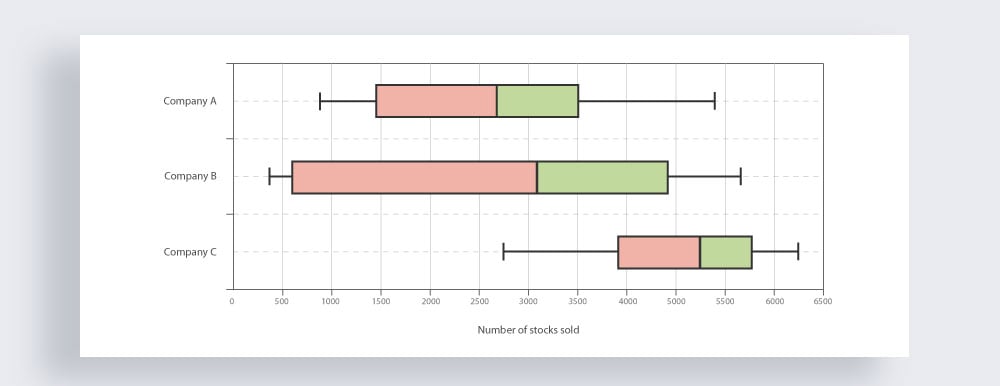
A box plot is a type of chart that visualizes data distribution and variability. Box plots have different sections which represent specific sections of a data set. Here's an example of a box plot.
The actual box represents the interquartile range in two sections.
The line between the two quartiles is the median. To the left of the median is the 25th-50th percentile and to the right of the median is the 50th-75th percentile.
Extending from the box are the whiskers, which visualize the variables in the upper and lower quartiles. The lines on the edge of the whiskers are the minimum and maximum values of the data set. If there are any outliers, they are plotted as dots outside of the min and max values.
Keep in mind that a box plot can be horizontal or vertical. Choosing which one to use will depend on how many data sets you need to visualize.
Box plots are a good choice if you have to visualize data distribution and variability. It’s perfect if you want to compare different data sets for a unified topic.
Also, a box plot visualizes data in a way that shows if it is symmetrical or skewed. It also does a good job at showing outliers in an easily understandable way.
Websites with tons of information can sometimes be overwhelming. Using an interactive decision tree helps your visitors make a decision about what they need from your content.
A decision tree is basically a flowchart, but a bit different from its static counterpart. What makes a decision tree unique it that it's completely interactive and intuitive.
Check out the example of an interactive decision tree below.
The example above shows the interactive decision tree in the Data to Viz website. Data to Viz is an online encyclopedia of all things about data visualization and the interactive decision tree helps users choose the right information visualization for their project.
Click here to see the interactive decision tree in action.
The best use for an interactive decision tree is to make it easier for someone to navigate your data. The data would need to be indexed with keywords and descriptions to work.
For example, consider a complex laboratory experiment about water health from different areas of a country. The results and studies can be indexed so that students or readers can navigate the data according to bodies of water or another value like a type of bacteria.
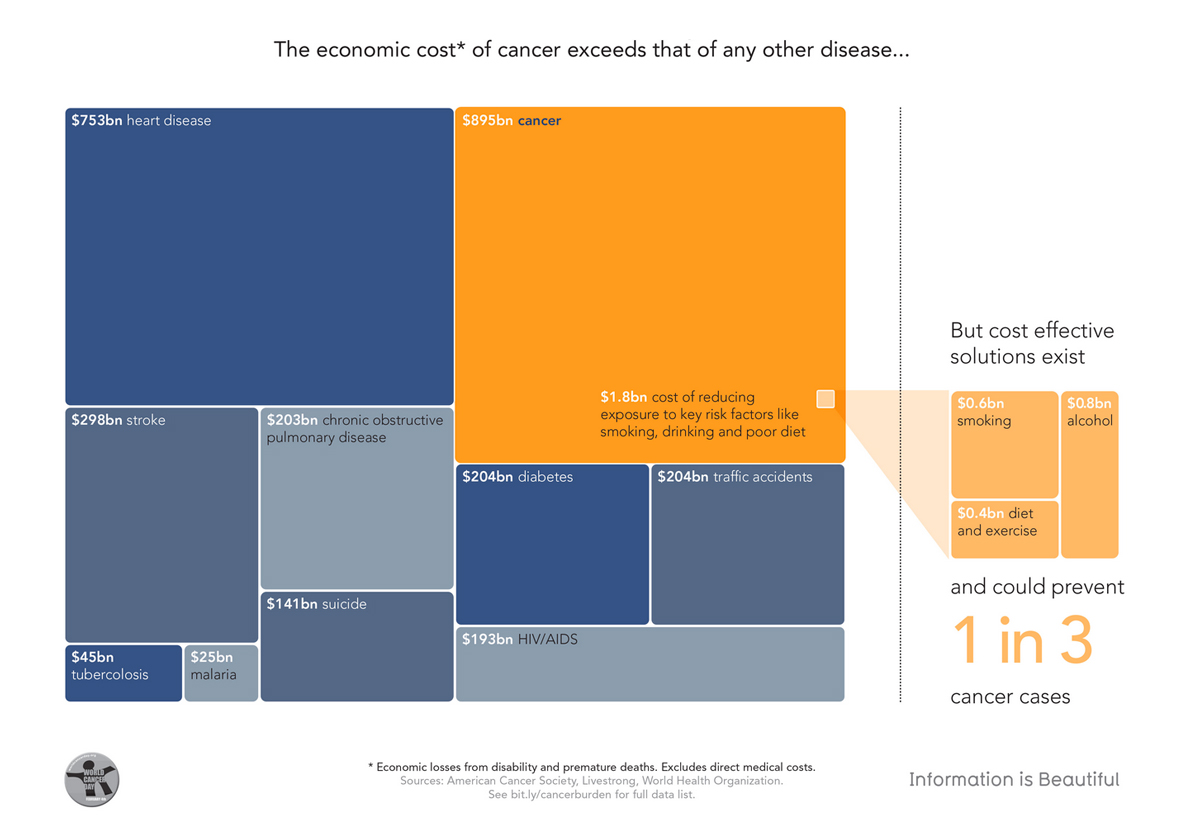
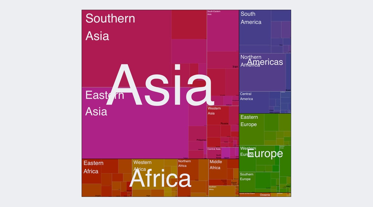
A treemap is a type of hierarchical chart used to show values of things in different categories. The values are visualized as squares and rectangles inside a larger rectangle.
The largest value is placed at the top left, and the diminishing values are displayed in a clockwork direction with the smallest values at the bottom right corner.
Here's another example of a more complex treemap design.
Treemaps are a useful type of information visualization to include in articles, blog posts, annual reports and other long-form publications about a given data set.
They work better with colors that look good together, as you can tell on the treemaps above. Treemaps are easy to make with a treemap maker like Vizzlo.
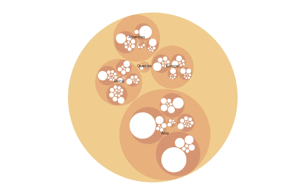
A circle packing visualization is similar to a treemap as it shows hierarchical relationships.
The larger circles encapsulate the smaller, but related, values. The circles are organized in a clockwise spiral from large to small inside each section.
The size of the circles represent a value but what can happen is that the actual numerical value cannot be discerned from the complete visualization. Circle packing is more of an explanatory hierarchical visualization than just a numeric data visualization.
The circle packing example above shows the repartition of the world population in 250 countries. It separates the countries first by continent, then by region and finally by country.
Click here to experience the interactive version.
Use a circle packing visualization when you need to demonstrate a set of data with strong hierarchical values. If there are lots of values to visualize, it's a good idea to make your graph interactive. The sizes of the circles depend on the numerical value of the data.
You can easily create a circle packing visualization with Visme. You can also add interactivity to it and even some audio narration if necessary. Here's how you can do that.
In the editor, simply add circle shapes in different sizes. Then, customize them with specific colors and arrange them according to the data. You might need to do some math calculations to know the exact size of the circles. Once you're done, add interactive links and hover effects.
Scatter plots are a common visualization tool for showing correlated date along a y-axis and an x-axis. A 3D scatter plot goes a bit further by adding a z-axis.
If the dots have colors, then another value can be added to the data as well. This type of information visualization works best with interactivity so you can look at the chart from different angles.
The example above is a screenshot of an interactive 3D scatter plot created with an AI tool. This link will take you to the data examples that you can use to make your own.
3D scatter plots are best used for heavy data sets with lots of variables.
Remember that the data used for a 3D scatter plot, just like a scatter plot, needs to be correlated data. Use a 3D scatter plot when the data has more than two or three correlated values.
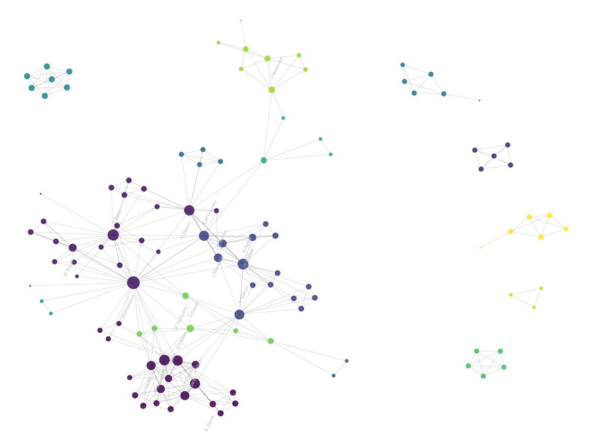
A network graph is is sometimes called a network diagram, but let's not confuse it with a diagram about computer functions. The purpose of the network graph information visualization is to show connections between things with the help of nodes and links.
The amount of nodes and links needs to be carefully calculated. If there are too many, the graph will start looking like a hairball and become impossible to read.
Like other types of visualizations, this one works best when it's interactive.
The network graph above is a visualization of how researchers appear in other researchers' scientific papers. The researchers are the nodes and the lines are the links to each other.
Read more about this visualization project here.
Use this type of information visualization when you want to display the connection between things in different categories and how these categories are also connected with each other.
For example, you can use a network graph to show connections between literary characters, or something more fun like the characters in the Disney Pixar world.
A violin plot is similar to a box plot, but allows for a deeper understanding of the distribution of variables. Each "violin" in this type of data visualization represents a group or variable, and the shape of the violin shows the density of the data points in that particular variable.
Here's an example of a violin plot.
The example above shows the relationship between chick weight and type of feed. You can find out more about violin plots and this specific one here.
The main difference between box plots and violin plots is that the latter shows more information, such as both the distribution and ranking of several groups or variables.
Even though a violin plot shows more information than a box plot, it's not used as often.
This type of information visualization is particularly useful when you're working with a very large data set and need to visualize individual observations and distributions.
Violin plots can be created in both vertical and horizontal shapes, depending on your type of data and how large your data set is.
Visualizing data in real time is a great way to add life to any project. Any type of data that is ongoing can be visualized with a real-time tracker.
Weather patterns, air quality, sports scores, train schedule delays, and traffic are some types of data that you can visualize using a real-time tracker.
The example above is a real-time tracker that shows the air quality and pollution index in the city of Bangkok, Thailand. Everyone who lives in Bangkok uses this tracker to see if they really need to go outside that day and which type of breathing mask they might need to use.
On a day with a score of 177, schools cancel outside physical education lessons, and people with breathing problems are advised to stay indoors.
Click here to view this interactive real-time tracker.
Real-time trackers are great for practical apps and websites that bring a service to the public. It’s perfect for displaying data that's in constant change and can affect decisions and outcomes.
The Visme graph engine has lots of charts, graphs and data widgets that can visualize live data. Try one and see if it can help your project.
You can create real time information visualizations with any of the data graphs inside the Visme editor. Simply upload your data from an Excel or Google sheet and showcase real-time or live data. You can use it on graphs, charts and even maps.
If your company has a solid creative team, then you might already be publishing visual annual reports. But if every year you publish a spiral-bound pile of spreadsheets and long, boring blocks of text, it might be time for you to look into a change.
The visual annual report below was designed for Clear Media by Phoenix Communications.
The best visual annual reports every year are usually online by creatives and amazed customers. Some even win design awards. Now that’s a marketing channel I bet you hadn't even thought of!
The annual report above won a Red Dot award for communication design. They used a laser cut-out approach and recreated a theater stage, visualizing the company’s vision and values.
A great visual annual report can follow the classic format of a book or an eBook.
With Visme, you can create lots of different kinds of visually rich charts and graphs to include in your annual report. Try including photography in interesting shaped crops and colored fonts.
You don’t need to be a designer to create a visual annual report in Visme. But if you really don’t have the time to do it yourself, you can also hire a designer or a design agency to do it for you.
Visme has lots of beautiful annual report templates that you customize for your own company. Choose between presentations, infographics and printable documents. Simply insert your content inside the templates and you’ve got yourself a visual and creative annual report!
Sign up. It's free.Want to create your own visual annual report?
In 2014, Microsoft created an interactive digital table with a screen that could display data in 3D.
It closely resembles what a hologram projection would look like, while still being displayed on a 2D surface. This type of visualization is still growing and will keep doing so for years to come.
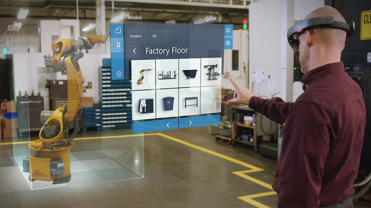
From the first holographic tables in 2014, Microsoft now has the Hololens, which is a set of VR goggles that lets users see data in holographic form.
In the video below you have see the holographic table in action. As you can see, it works for many types of data, from maps to Star Wars memorabilia.
A holograph table would be amazing as part of a museum exhibit to let visitors discover data. Educational projects about science, geography or medicine could also use this type of visualization.
It might not be the right tool for small data sets or if you need a visual for an article. This type of information visualization is definitely for big-scale situations.
Another innovative idea to visualize data is to use virtual reality. Nearly every type of information visualization can be turned into a virtual reality experience.
Check out this cool virtual reality visualization of patient data created in partnership by Ogilvy CommonHealth Worldwide and Patient Connect.
Virtual reality is still a crowd-pleaser at conferences and symposiums. Regardless of the field you are in, show off your data by giving your guest a pair of VR goggles and a pointer.
Let them discover your information as they marvel and how amazing it all looks!
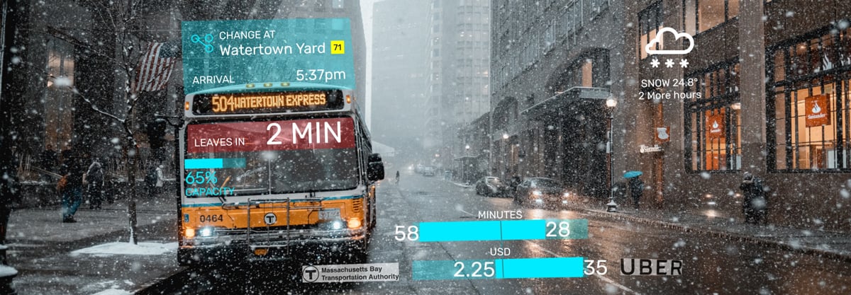
Augmented reality is one of those things that have been sneaking into our lives for a few years now.
A mix between virtual reality and real life, what augmented reality does is mix your surroundings with digital information. This is possible through special AR goggles.
Here's an artist's rendition of how augmented reality will evolve.
There have been some attempts at getting this to be a trend, like with the Google glass a few years ago. Actually, the new Google glass now uses AI and has started incorporating augmented reality.
The link between visualization and augmented reality is that data can be shown about anything the user is looking at. The ideas and uses are truly endless. From instant dietary information displayed on items in a supermarket shelf to traffic and weather information while looking at a bus.
Microsoft has recently released Hololens, a set of AR lenses which look like huge sunglasses, for big businesses that need lots of data displayed at once, like on the factory floor.
Click here to find out more about Microsoft's Hololens.
We can’t wait to see how all this tech evolves so we can use it create better data visualizations!
As augmented reality grows in popularity, most big companies should be looking at incorporating it into their repertoire. Since pretty much any kind of data can be displayed using augmented reality, it’s first necessary to figure out what can be created to help the consumer.
Augmented reality visualizations are created as apps which are then loaded onto the AR lenses.
An art gallery, for example, could create augmented reality visualizations about the art on display. The data shown could be historic, informative, or entertaining. A famous painting could have the artist’s original sketches show up to show the creative process.
The use of information visualization is widely varied and creative.
With so many different options available, it can be difficult to choose. We hope that this post has helped you see new and innovative ways to visualize your data and information.
Many of the information visualization ideas above can be created with the tools inside Visme. Try out the map engine, graph engine or the intuitive data widgets. You can sign up for free!
Did we miss any type of creative information visualization? We'd love to hear from you! Let us know your suggestions, feedback and questions in the comments section below.
Design visual brand experiences for your business whether you are a seasoned designer or a total novice.
Try Visme for free

About the Author
Orana is a multi-faceted creative. She is a content writer, artist, and designer. She travels the world with her family and is currently in Istanbul. Find out more about her work at oranavelarde.com