Why Color Theory Matters on Social Media

Images are king on social media. The 3.2 billion active users across all platforms are eager for relevant content, and imagery is an essential piece of capturing their attention. 65% of people retain information they saw paired with an image, compared to 10% of people who simply heard a piece of information. Facebook posts with images receive 2.3 times the engagement of posts without them. And with easy access to a cell phone, social media managers can create a steady stream of image content.
However, we still need forethought, planning and a discerning eye to create high quality images that are truly memorable and fit a brand’s tone. If you have access to a skilled graphic designer, leveraging their expertise can ensure your images are aesthetically beautiful and consistent. If you don’t have this resource available (and even if you do), it’s beneficial to study a few key elements of design and how each applies to social media imagery. The foundation of all images is color – even those in black and white.
Color Theory
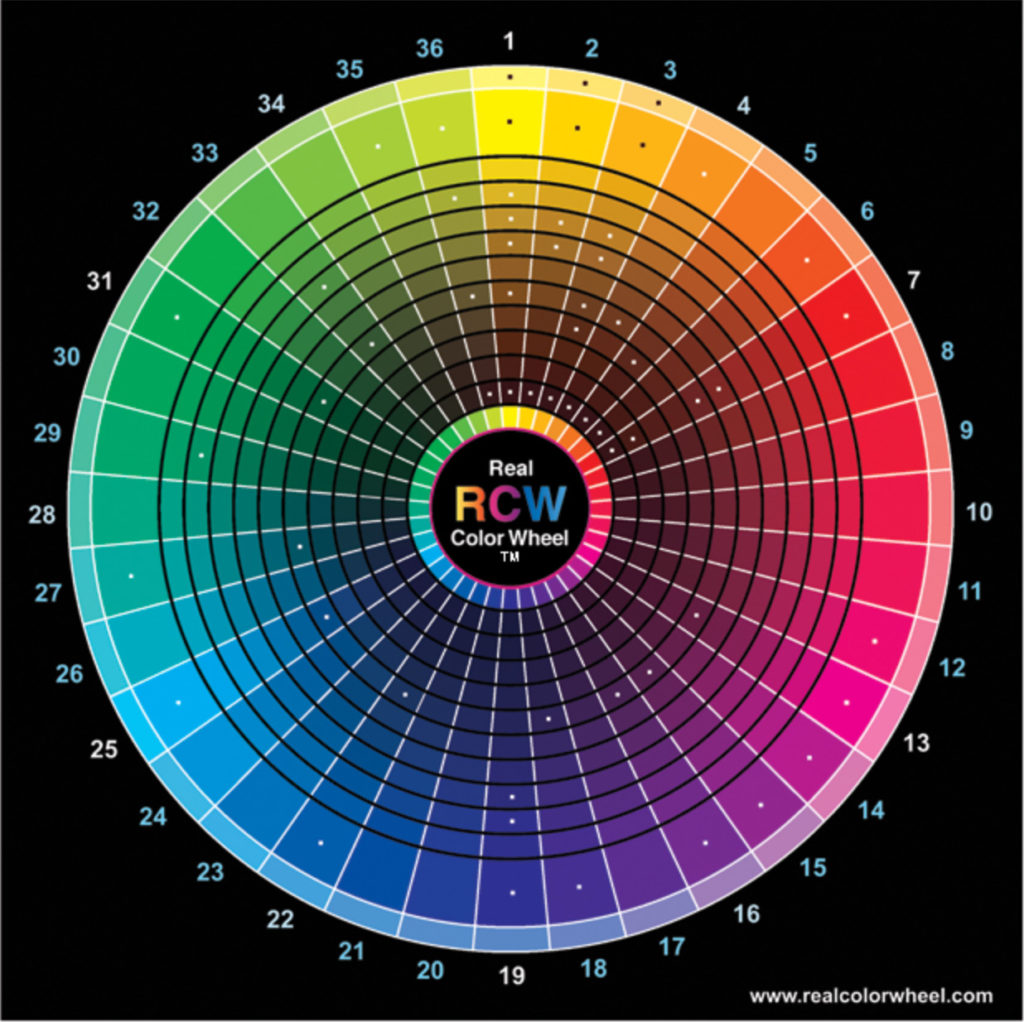
Color Theory is a broad term that encompasses decades of scientific study and exploration. The base is the color wheel, which itself has a multitude of iterations. The key parts of any color wheel are:
- Primary colors: red, blue and yellow. All other colors are made from these three.
- Secondary colors: green, orange, and purple, each made from some combination of primary colors.
- Tertiary colors: made by mixing a primary and secondary color, these expand the color range infinitely.
Any color wheel you choose can guide you in complimentary colors or “color harmony.” Colors and shades directly across from each other on a wheel are complimentary, meaning that when paired together, they provide contrast that is pleasing to the eye. Color harmony involves analogous colors – any three colors next to each other on the wheel. The contrast or lack of that these sets create makes an impact, even if the image is altered to black and white.
You should also be aware of meanings of colors in different cultures, and how warm and cool shades evoke emotion. Human emotion and color are strongly tied together and planning your images with this in mind helps create the atmosphere, tone and action your brand is hoping for.
Color on Social Media
We all have at least a vague idea of images that look “good,” perhaps without understanding why. When you apply color theory to the photos you take and graphics you create for social media, you’ll start to grasp the science and art behind it – and be able to create images that show a consistent brand and drive your followers to action.
When setting up a photo or beginning to design an image, first consider your brand’s color scheme. If you have a well-designed logo/branding guide, it’s likely that the colors are already complimentary or analogous. These colors are good choice for your base social media palette. Try to plan images that include these in some way.
Complimentary colors create contrast, a technique you can use to bring the eye to a focal point. Contrast in images has also been shown to drive conversion rates.
Colors also invoke emotion. If you’re going for feelings of warmth, power or love, choose colors in that range: reds, pinks, oranges and yellows. If you’re aiming for soothing and calming, choose a blue or a green. Carefully consider the target audience, and how their cultural background affects perceptions of color.
Hues appear differently on computer screens than on printed out paper. A color you choose from printed brand material may look slightly different on a computer screen, as will colors in the photos you take. You may need to edit and adjust images to get your desired effect.
Inspiration from a few brands killing it on Instagram:
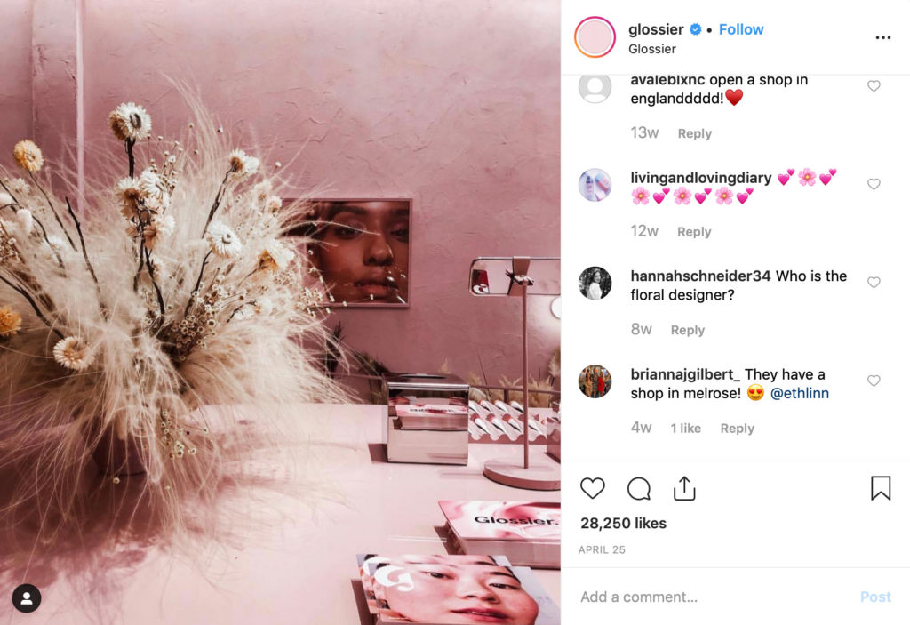
Glossier – this brand sticks to their color palette of soft pinks and whites. This recent post uses analogous colors, evoking a soft, feminine vibe.
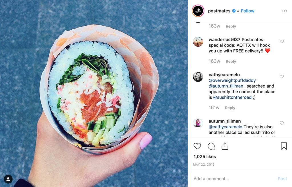
Postmates – not surprisingly, Postmates’ feed is filled with tasty shots of food. This one in particular shows a “sushirito.” The bluish background, broken up by the white of the rice, makes the pinks, reds and oranges pop and mixes warm and cool tones to portray summer and a refreshing treat in one photo.
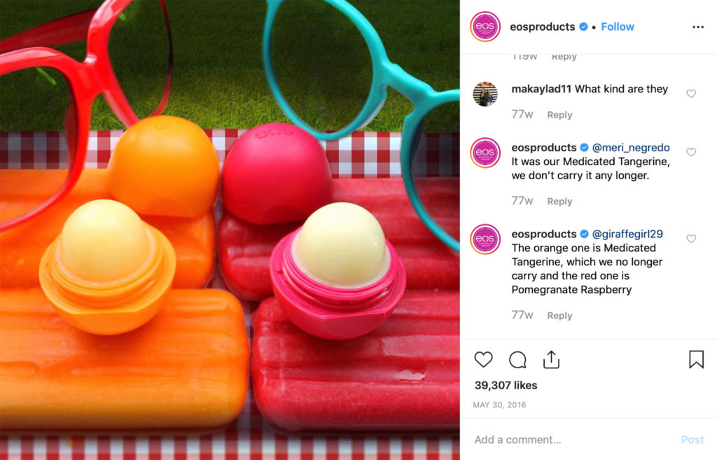
Eos Products – This visually striking shot uses both complimentary and analogous colors. Blue and orange are complimentary, as are pinks and greens. The photo is composed to make the products stand out, without being too obvious.